Tuesday 10 April 2012

Exercise - Vertical and Horizontal Frames

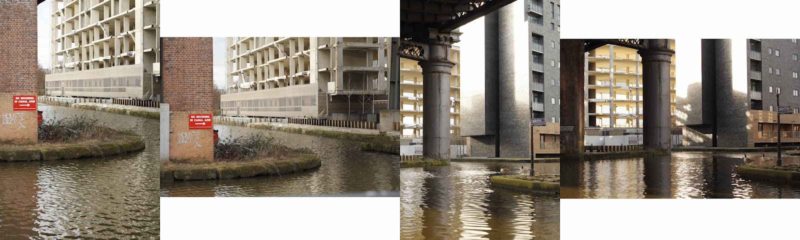
For this exercise I was required to take 20 pairs of photos - one using a vertical and the other a horizontal frame.  I decided to use the same focal length lens not just for each pair of photos, but for all the photos.  I used the Canon 50mm f1.8.  I did this because I thought it would show some consistency in the feel of the pairs of photos and also because it would take away part of my decision making process when looking for a shot.  I hoped this would allow me to concentrate on the vertical/horizontal aspect of framing a picture.  I also just wanted to practice with that lens a bit.  There has been no cropping or editing done to these photos as I felt that the precise reproduction of the way I framed the shots was vital to the exercise.

Subject: Various around Manchester

Whilst taking this set of photos, one thing quickly became apparent - my decision as to whether to frame in the vertical or horizontal is one that I often do not consciously think about.  When my eye is met by a certain scene I instinctively draw the camera up and look to frame the shot, regardless of the aspect.  I found that I had to restrain myself from doing this and consciously frame in the vertical, take the shot, then adjust to the horizontal and re-shoot.  This is not to say that I would never instinctively frame in the vertical, this happened often, but that it was a decision I was taking without properly thinking it through. 

Conclusion

Each of these pairs of photos is different and some of them help explain the points of this exercise more than others.  I haven't written an analysis of each shot as this post could go on forever.  Feel free to have a look for yourself.

Sometimes I found that the aspect I initially chose was the best one for the scene, sometimes I found it was not.  What became apparent, though, was that with a little adjustment (occasionally more than a little) to the framing, most scenes could be made to work both in the horizontal and the vertical.  Looking through the pairs, I can choose a favourite from each of them, but is this the definitive 'best' shot, or is this just my subjective choice?  Obviously certain scenes naturally suit a particularly aspect, but that is not to say the other way could not be equally suitable, if not superior - I think it is a matter of keeping an open mind before you go to frame the shot.  

Equally, you could just shoot in square format, and erase this issue altogether.  This weekend I saw a brilliant exhibition on Roger Ballen's work at Manchester Art Gallery.  I think every shot was in square format.  Did every shot he took over the last 30 years suit square format over a horizontal or vertical format?  Certainly, ongoing themes and a need for a consistent style were present, and most of the subjects were intricately set up and precisely framed, but I'm sure certain shots could have been done equally well in another format.

So with this, I will go away trying to remind myself to be open-minded with my choice of framing and not simply conform to the standard set for that scenario which creeps in without my realising it.


Friday 17 February 2012

Exercise - Positioning the horizon

Subject - Cemetery


For this exercise I had to find a 'viewpoint outdoors that gives you a reasonably interesting landscape in which there is an unbroken and clear horizon' - not as easy as it sounds when you live in a city.  I made the obvious choice, and headed for the cemetery.  It was quite late in the afternoon and there was a slight orange-pink tint to the light.  While there was no direct sunlight on the foreground, the sky and clouds were quite bright, making metering tricky.  I tried to keep the range of images as consistent-looking as possible with regards to exposure, without over or under-exposing those at the book-ends of the sequence.


The first and last of the sequence, as I thought at the time, do not work very well.  This is due to a lack of detail in the foreground in one case, and not enough drama in the clouds in the other case.  By the third image in the sequence, the horizon is positioned one third of the way down the image, and I think the composition is a lot more pleasing.


With the horizon at exactly half way, I think the image is surprising balanced.  While it is possibly 'static' I do find it quite harmonious and I believe this is because the equal proportions of sky to land is mimicking the symmetry in the other axis (between the left and right side of the image).  The next image is my favourite, with the horizon a third of the way up.  We can see more of the cloud formation while placing the detail of the gravestones and trees at a nice level in the frame.


These final two photographs, as I explained before, do not work as well because they are beginning to cut out the detail of the gravestones.

As I was leaving the cemetery I thought to myself: will people mind if I take photos here? Is this private property?  I'm not sure what the answers are, obviously I wouldn't take pictures of anybody while they were visiting, but perhaps someone might mind anyway.  If I ever go again I might try and find a gravedigger someone working there to ask permission.


Friday 10 February 2012

Exercise - Balance

Here I have taken six of my already-taken photographs (I decided to use holiday photographs - some made using a 'toy' digital camera - the Digital Harinezumi), attempted to identify the dominant areas of the image and then to show how they balance each other within the image to create some kind of harmony.  Sometimes the dominant areas may only be small but due to their colour, tone, detail, interest level or placement may still dominate the photograph.

What I have learnt here is that strong colours are dominant or 'heavy' and therefore to achieve balance it helps to position them towards the extremes of the image or to balance them with for instance larger areas of  less intense colour, or an object with interesting detail.  Horizontal symmetry creates a simple balance as shown in two of the images above, and open space can be used to create balance in a frame.  This is shown quite well by the image in the top-left where the two characters in the foreground need the open space and blanket of colour to balance their presence.

It is strange to look at and analyze my images in this way.  I think I will have a look through some more old pictures and continue this further.  It raises a question - was I consciously aware when taking these photographs of creating visual balance in the frame?  Perhaps not - maybe it just happened naturally - certainly some of my images are not balanced properly and would be better if they were, but I will endeavour to be consciously aware in the future and see if that helps.

Tuesday 7 February 2012

Exercise - Focal lengths and different viewpoints

Subject - Apartment building

For this exercise I was required to take two photographs of the same subject, the first from distance using a telephoto lens, the second from close-up using a wide-angle lens.  The purpose is to highlight the change in perspective different lenses can produce.  I chose to photograph this apartment building from an angle so that the wide-angle shot would highlight the depth in the image compared to the other image i took from across the street using a longer focal length.

Left - focal length 53mm, Right - focal length 16mm
I think these images have demonstrated this effect quite well.  While they fill roughly the same space in the frame and are taken from similar angles, they are completely different images.  The first at 53mm is as you would expect, quite flat and lifeless, however, the verticals are straight and true so in that sense it as a correct reproduction of the actual building.  It is difficult to gauge distances within the image, such as from the fence to the building or the tree. The image at 16mm demonstrates massive converging lines - the building appears to be falling over backwards - due to the angle of the lens pointing above the horizon.  There is much more of a feeling of depth, life and vibrancy to the image with the distances being exaggerated due to the wide-angle lens.  The front wall of the building has been transformed into a wedge shape whereas before it was an almost regular rectangle.   I find wide-angle image much more interesting, even if it is falling over backwards.

Thursday 26 January 2012

Extra-curricular

Last night I went for a walk down by the canal while on my way to a friend's house.  I found a couple of interesting locations that I hope to use on some of the next course exercises, however, the real gem was this canal underpass that stretches beneath the motorway, which also has a busy tram line running underneath.  The light was very dark and atmospheric, a bit creepy, it seemed perfect for a long exposure with the tram speeding past.  After spending half an hour getting it set up correctly, waiting for a tram to go past while dodging cyclists going down the path and getting the shots, I packed away.  Then I remembered I had set the camera to a low detail level for some reason and not changed it back - oops! Start again....

'all our transport' - Tamron 10-24mm @ 11mm, 8 secs @ f8, ISO 3200, Auto WB, tripod

I'm quite pleased with how this turned out but there are definitely some other interesting angles to photograph at so I think this spot demands another visit.  There were a few semi-sunken boats and barges further up the canal that looked pretty sad which I'll have to remember about as well.

Looking at this from a compositional sense, I have tried to place certain things in certain places, for instance the angle of the wall meeting the top-right corner of the frame and the edge of the path meeting the bottom-left corner.  Otherwise I have let the leading lines running through the image do most of the work.  The wide-angle view is also accentuating the converging lines which also give the roof this lovely 'fan' shape.  I wish the whole roof was an even brightness, perhaps it could be evened out in photoshop, or maybe next time I will take a flash or a torch with me and give that roof area a bit more light.

Wednesday 25 January 2012

Exercise - Object in different positions in the frame

Subject: Chest of drawers in an alley

I had taken a set of photos for this exercise already.  They were of an owl carved out of a tree trunk in the park, however, on further inspection, they were rubbish.  The light was very dull and because the subject was of a similar colour to the rest of the picture, it didn't really stand out.  In different light it might look better so maybe I will have another go at it one day.

Instead I have found this lovely set of drawers at the end of the alley behind where I am living.  Unloved, unwanted, with a rusty nail-ridden plank of wood on top, they have been unceremoniously thrown out with the rest of the rubbish.


I took six photos.  I have tried placing the subject in the centre, off-centre to the left and right, and also in the top-left and right corners.  The final image I took (bottom right), has been placed just off centre to the right, and I changed angle slightly, bringing the top of the wall to the left into the shot and getting more of the black rubbish bags in frame as well.

Normally I would agree that the subject should be placed off-centre so that the background doesn't look 'punctured', however, I don't feel this is the case in this situation.  To me, the final image with the subject very slightly off centre feels the most balanced.  I think this is because the black bags on the right hand side need to be countered by some open space on the other side of the frame which this particular framing has.  I quite like the image with the subject placed in the extreme top-right corner of the frame - the open space infront of it is quite appealing and could indicats movement in that direction - perhaps the drawers are slowly shuffling their way down the alley?

Conclusion

Never place the subject in the middle of the frame, unless of course it looks better that way.  I suppose rules are made to be broken.

Tuesday 24 January 2012

Exercise - Fitting the frame to the subject

Subject: Fidelity Rad 24 radio


Having ventured out between the showers on Sunday afternoon to find a subject suitable for this exercise, I was promptly sent retreating back to the house by more rain.  As such I decided that this old radio in the kitchen which belongs to my housemates might make an acceptable subject for the exercise.  It is interesting enough to look at and has some nice detail when viewed really close.  I've been told it belonged to my housemates grandmother initially.  There's a great vintage look to it, it's in fine working order and a quick google search tells me it was made in London in the early 70's.  Fantastic.  We leave it on when there's nobody in the house, to keep the dog entertained.  Not sure what will happen when they switch off the analogue radio signal, they might have to buy a new 'vintage-look' DAB radio to keep the dog happy, unless he likes listening to static.

I will refer to the photos in clockwise order, from top-left to bottom-left (1-6) 
(1) - This is the first shot I took, as the exercise suggested, without taking too much time to think about the composition.  I had already decided to take the shots head-on and not from an angle, to show as much of the frontal detail as possible, and also because I felt this suited the surroundings better.  I actually think this image is not that bad.  There are some nice colour highlights from the teacups and the scrubbing brush to accent the plain silver and black of the radio.


(2) - Tightly cropped, the long focal length has made all the background sufficiently out of focus to show off the shape of the radio and the slight wonkyness of the two dials at the top right.


(3) - Here I've moved in close to highlight the detail of the radio.  I didn't feel like this was close enough to show off the detail effectively.


(4) - I switched to a macro lens, and got as close in as I could get, framing around the writing in the bottom-right corner.  I think this image is much more effective than the previous shot - you can clearly see the tiny dents, cracks and dirt on the metal detail.


(5) - A more wide-angle shot.  I spent a bit of time framing it right up to the edges of the cupboard doors, also trying to keep all of the right hand glass-shelf/box on the wall just in shot.  Sadly, I actually think the first shot I took quickly looks better than this.


(6) - I decided to see what a different angle would look like.  The coloured teacups slightly take over the frame and I think it has become a slightly cluttered image.


Cropped versions of pictures 1 (left and middle image) and 6 (right image)
These are some cropped versions of the images.  I used a square crop on the left-hand image. I think this focuses the attention on the radio, with the colourful teacups not dominating, and much less background clutter.  If I was to take this photo again, I would remove the pasta jar from the background as I find it distracting.  Is it possible the square format is slightly reminiscent of the era the radio is from?

The middle image makes me think of an identity parade.  The wide-angle format is quite interesting and although the other objects on display are quite prominent, I think the uniformly rectangular radio still just manages to dominate the photo.

The third image is a tighter crop of photo 6.  I like the angle of the lines of the work surface and how the pure white contrasts with the colour of the teacups.  Unfortunately they are still taking over a bit from the subject, and I was unable to find a nice crop that completely removed the blue towel.


Conclusion


This exercise and the subsequent attempts at cropping have been very useful.  It has taught me I need to take even more time when framing my subject, to be imaginative and try to visualize cropping bits out of the photo.  Also, as Clive Minnitt and Phil Malpas mention in 'Finding the Picture' - "Be bold.  Don't allow the fear of making mistakes stifle your creativity."  I will try to do just that.